How To Trade In Equity ?

Here you will get the Basic Methods of Trading in Equites & Bonds, which are supported by well known Equity Trading Guru.

Have You Joined This Blog ?

Please Join This Blog, Before Leaving , It will Make this Blog Reachable to Others Investors. Please Refer This Blog to Your Friends Also.

Sunday, October 17, 2010

SMOOTHED RSI INVERSE FISHER TRANSFORM

SMOOTHED RSI INVERSE FISHER TRANSFORM is one of the best Trend Reversal Indicators widely used in 1min to EOD price Chart. Scan Version of this Amibroker-AFL will be made available shortely.

Moving Averages, First Principles

Of all the technical indicators, moving averages are perhaps the most widely used and misunderstood. Incorrectly applied, as is usually the case, they may be responsible for more losses than any other indicator. Correctly applied, however, they can be the most versatile and powerful tools available. The reasons for failure? First, a poor understanding of how stock prices move, and second, a poor understanding of the properties of moving averages.
It is important to note that if the user does not attempt to understand how prices move, then applying any indicator is a haphazard affair. Indicators tend to be developed by trial and error, and without a clear understanding of how they work, using them can lead to disappointing -- and disastrous -- results.
FIGURE 1: DAILY DIFFERENCES. The differences between one day's closing price and the next is plotted for IBM stock over a four-month period.
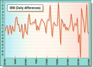
STOCK PRICE MOVEMENTThe point-to-point movement model is based partly on the one put forward by analyst J.M. Hurst a number of years ago and partly on my own research. In this model, stock movement is considered to be composed of random point-to-point movement and complex cyclic movement. Point-to-point movement is simply a generalization of the sampling interval and refers to the change between one data point and the next, such as "tick-to-tick," "day-to-day," and "week-to-week," as well as others.
POINT-TO-POINT MOVEMENT
Point-to-point movement is easily extracted from stock data by most technical analysis programs. An indicator is usually available that will give the difference between successive points; if not, such an indicator can often be created within the program. As an alternative, stock price data can be imported into a spreadsheet and the successive differences calculated and plotted. This method is useful, since a spreadsheet function will be available to determine the standard deviation of these differences, a valuable quantity that will be discussed later.
The point-to-point differences can have negative, positive, or zero (no change from the previous point) values. A plot of these daily differences over a short period can be seen in Figure 1. The vertical grids are spaced at 10-day intervals, and the vertical scale is in dollars. A sequence of changes in the same direction is indicated by the plot remaining on the same side of the zero line.
A close inspection of the differences reveals that the longest such sequence occurred between June 18 and July 2, 1998, and extended to eight successive rises. The extreme peaks and troughs have no meaning other than they are the maximum changes recorded. In general, a sequence of more than 10 successive moves in the same direction in a stock almost never occurs.

Trading Andrews Lines

About 20 years ago, I first learned about the work of Alan Andrews and his pitchfork charting technique. The concept seemed fairly straightforward; you start with a sequence of three turning points identified as the most significant highs and lows of the time frame you are working in. This can be either a high (A), low (B), high (C), or a low (A), high (B), low (C). (See Figure 1.) Next, you draw a line between the last two turning points (B and C), find the midpoint of that line (D) and draw a line from A, through D, and extend it to the right as far as needed (E).

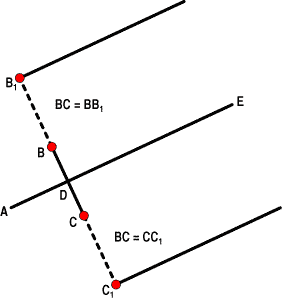
FIGURE 1: PITCHFORK CONSTRUCTION. From low A, draw a line through the midpoint of BC, extending it to E.

Then, extend the BC line both up and down by a distance equal to B-C in each direction, the endpoints of which I can label as B1 and C1. Now, draw lines from B1 and C1 to the right and each parallel to the ADE line. This forms a type of angled pitchfork set of lines where the lines from B1, D, and C1 are all parallel to each other. Additional parallel lines of B2 and C2 and so forth can be added, but I've never bothered with the extensions of even B1 and C1.

As I understood it, Andrews' basic tenet was that prices would tend to move out from C along either the C parallel line or between the "prongs" of the pitchfork -- that is, between the C line and the D line. That way, you would be able to determine how prices would move.
That's all I heard about Alan Andrews. The idea intrigued me, though, and I eventually set out to understand and expand upon the concept. I hope this will help you understand the ways the markets move.
In a wonderfully simple universe, the reaction from point C should come back toward line ADE and touch it at a point roughly equal in distance from D as is A. If I mark this as intersection point E, then in a perfectly symmetrical situation, the distance from D to E would be equal to the distance from D to A.
You simply continue the process as the market action unfolds and confirms new turning points. In the example in Figure 2, you would find the midpoint between C and E, mark it as F, and then draw a line from B through F and extend it to the right by a distance equal to B-F. I would label the end as point G. This new point G now becomes my next ideal target in both price and time.
You'll be surprised at how often this technique can actually identify a point in both time and price, when the market has a high probability of turning. When it doesn't behave in this perfectly symmetrical fashion, things become intriguing. With careful study, the market action around this first principle will begin to hint at what it's going to do next.